Savr Design Sprint | Case Study
The Problem
Savr is a new recipe app designed to help at-home chefs make delicious meals in a manageable time.
Savr has recently received a number of negative reviews concerning advanced cooking techniques, lengthy steps, and unorganized preparation. Users are ending up disappointed with the outcome of their meal because the instructions are unclear and don’t provide imagery showing each step. Many people are frustrated with the meal preparation; users want to prep everything they can up front before starting to cook but are finding they need additional prep later in the recipe. Majority of users work full-time and want to make sure the time mentioned is accurate and the techniques mentioned are clear, even for a beginner chef.
The Solution
I was brought on board to run a modified version of GV’s design sprint to address the negative reviews mentioned above.
Key insights:
Pain point: timing. Users want to prep everything upfront and are finding more prep work later in the recipe.
Long winded text and lack of imagery/visual for more advanced cooking techniques
Make sure at-home chef’s are given accurate time involved, even if they are beginner chef’s.
Day 1: MAP
I spent the first day of the design sprint getting familiar with problem. The purpose of this day was to spend time understanding the app and map out a possible solution.
Day 2: Sketch
The second day of the design sprint was all about sketching. For my technique, I used lightning demo’s to sketch out 10 screen solutions. During this phase of the sprint I also spent some time researching competitors to see how their interface solved the pain points SAVR users were experiencing.
Competitor Research
When reviewing a recipe, sometimes I don’t know what certain ingredients are. I liked having the picture in the ingredient list to better understand the ingredient.
Sketching
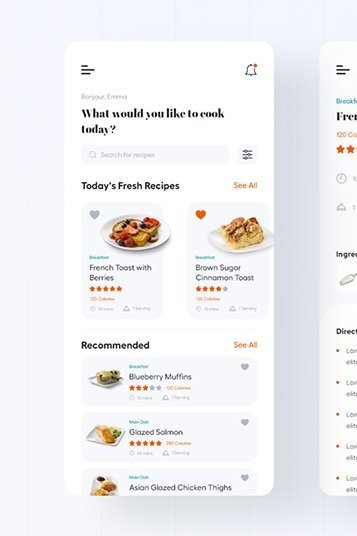
Some nights, just finding a recipe is tricky. It would be great to search by popular recipes and see what other people are cooking.
Day 3: Decide
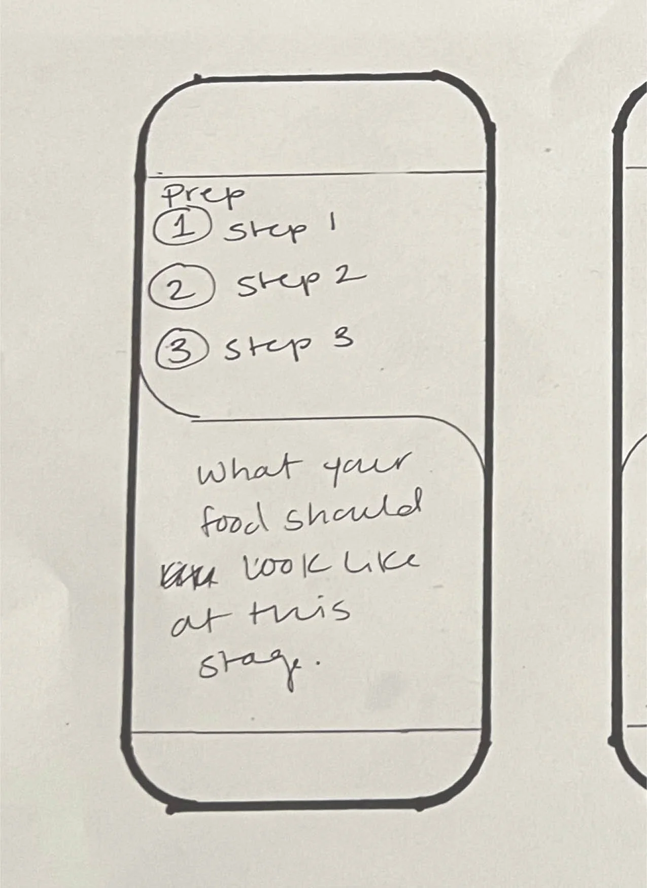
I spent day 3 creating a storyboard, sketching out the wireframes I would use for my prototype. Savr’s main user concerns were navigating the recipe steps, understanding advanced cooking techniques, and focusing on clarity/organization of food preparation. My initial sketches felt all over the place and I wanted to take the day to focus on the wireframes that best addressed Savr’s pain points.
Focused on addressing advanced cooking techniques and using imagery to replace long winded text.
One of Savr’s main user concerns was difficulty understanding advanced cooking techniques. Sometimes a short reel or video can give a clear visual on what to do so a user doesn’t spend wasted time researching the technique or fail when attempting to do something new.
Review visibility is super nice. Other people may have had difficulty with certain steps that you could research before getting started with a recipe.
Users liked the ability to navigate between preparation and direction tabs. They also appreciated the difficulty rating being clearly visible before they started cooking.
I loved the category break down for this app. Sometimes I want to have breakfast for dinner and this makes it super easy to search for that option!
Bring clarity/organization to food preparation.
During the users journey cooking with Savr’s app, users are becoming frustrated with additional prep-work needed near the end of the recipe. Users would like for all prep to be listed at the top of the recipe so they don’t waste time going back and forth while cooking.
Day 4: Prototype
The fourth day of the design sprint was dedicated to prototyping and bring the sketches from day 3 to life. This day involved creating high-fidelity screens and bringing life to the solutions I discovered in days 1 - 3.
**For this prototype, I used a halfbakedharvest recipe since that’s all we cook at home. Her recipes are the best and you can find them here: https://www.halfbakedharvest.com/chipotle-salmon-burgers/
Day 5: Test
The final day of the design sprint was spent testing my high fidelity prototypes. During day 1, I identified my user as the busy chef and wanted to ask full-time working friends to test my prototype.
User test findings:
Users liked being able to hover over an underlined ingredient and see a picture of something they might not be familiar with.
Testing participants thought it might be helpful to have the reviews shown at the top of the recipe. Maybe (1) positive and (1) negative so they could have a better idea of what they were getting into.


